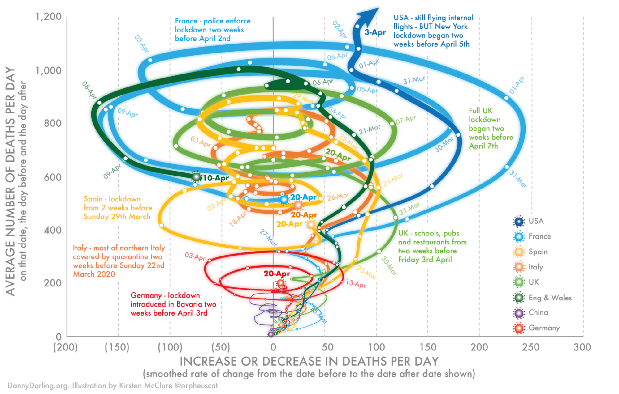
La référence originelleCovid19 | SLOWDOWNThe data for these graphs show can be found here. The numbers are the same as shown here, and here. They are occasionally revised when national authorities revise their estimates for dates in the past.For any given day the number of deaths in that day is estimates as the simple average of the number that occurred the day before and the day after.http://www.dannydorling.org/books/SLOWDOWN/Covid19.htmlPour essayer de mieux comprendre le concept des connected scatterplotDraw Your Own Connected ScatterplotDraw Your Own Connected Scatterplot Inspired by Haroz et al., this interactive notebook lets you draw a connected scatterplot and see the corresponding dual-axis time series line chart. Draw a line here: Here's the corresponding dual-line chart: In the dual-line chart, the x-axis represents the time you spent drawing the line in seconds.https://observablehq.com/@mbostock/draw-your-own-connected-scatterplotMais cela reste très subtil car l'axe (increase/ decrease of deaths) est la dérivée de l'axe y (number of deaths).